“From a simple sheet of paper with a few precise gestures an origami takes shape.”
Creating a logo is collaborative work. We talked with Laurence and Eléonore to understand their expectations and needs. We conducted market studies, analysed the strengths and weaknesses of the current identity, and explored themes. We work in such a way as to find not just an idea that pleases the client but the best solution that will push the project into the future.
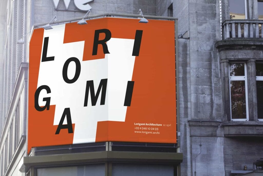
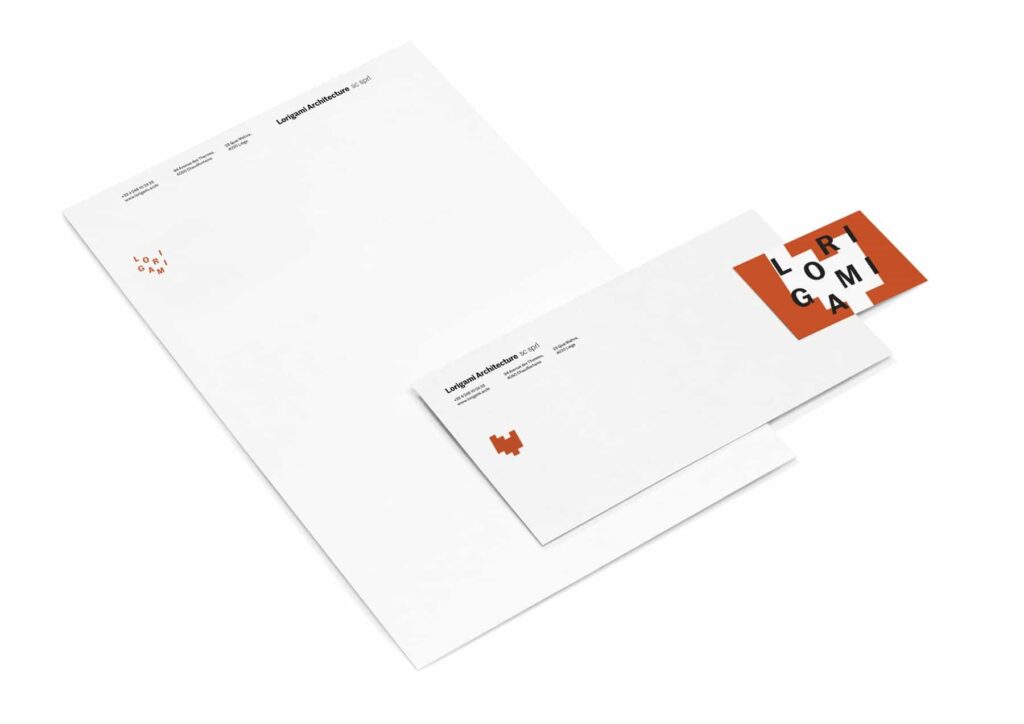
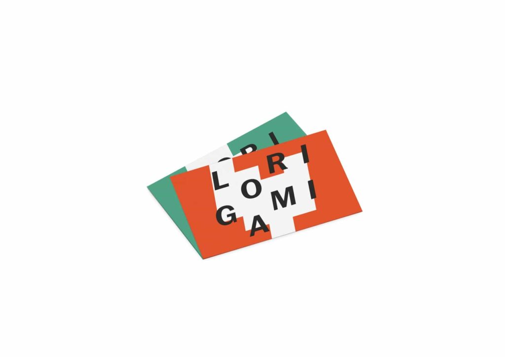
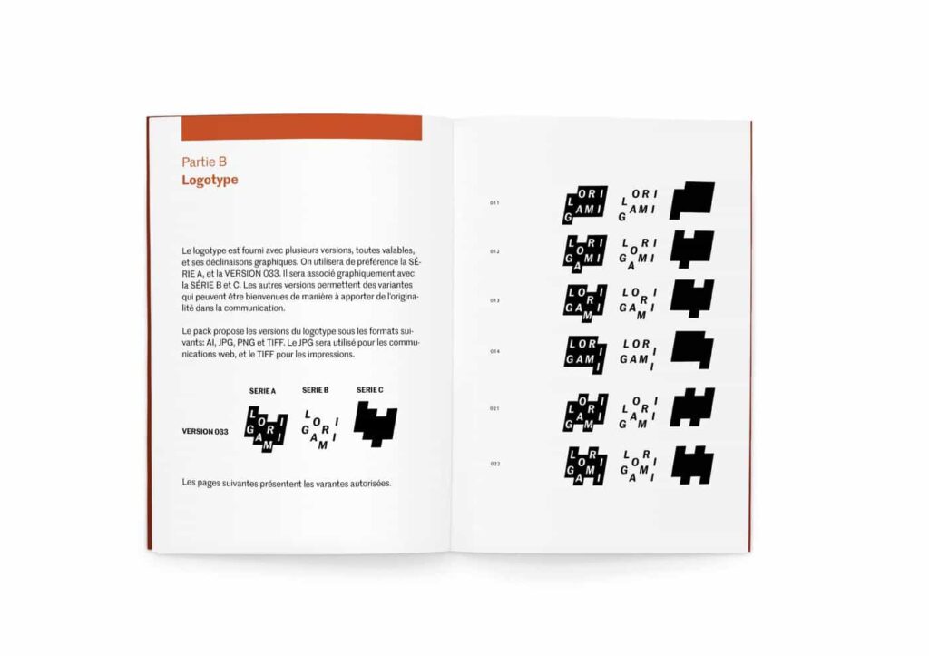
One identity, multiple logos
Lorigami’s logo comes in different forms according to a strict grid, thus reflecting the specificity of each architectural project.
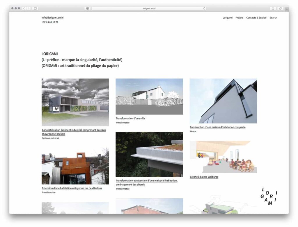
They create roofs, we host them on the web
We also created the company’s website, offering not only web management services, and configured applications to facilitate collaborative work.
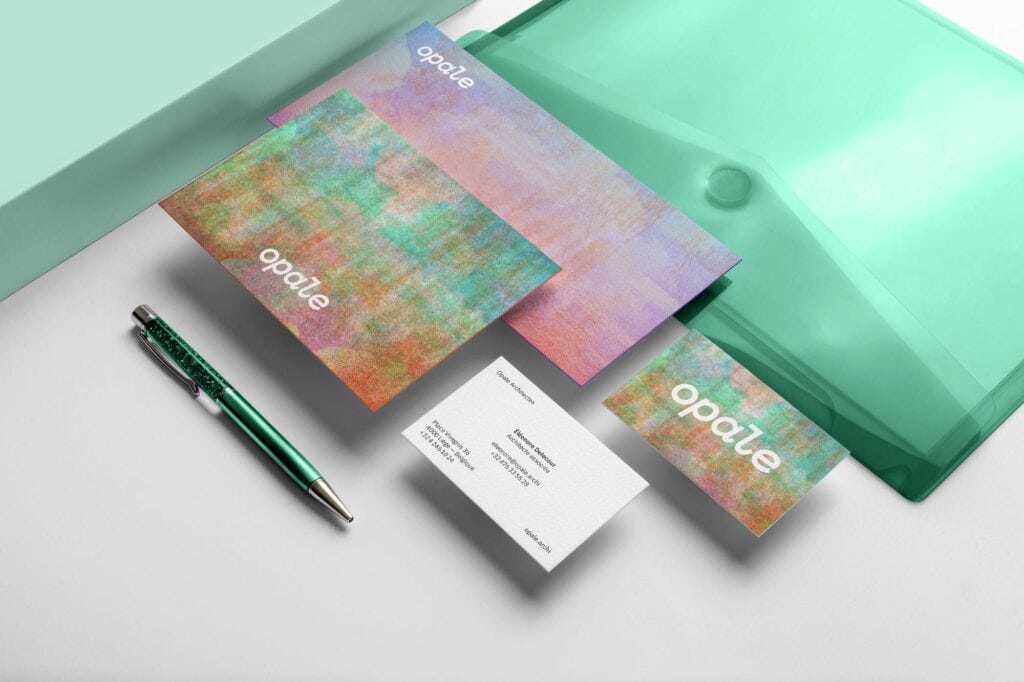
Opale Architectes A collaborative design process rooted in context, materiality and use — crafting adaptive spaces where architecture connects people, places, and stories.
YEAR
2025
SERVICES
Brand Strategy
Brand Design
Graphic Design
Web Design & Hosting
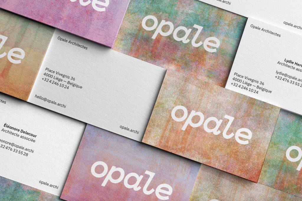
A Precise & Functional Logotype
The visual identity of Opale Architectes is built on clarity, functionality, and architectural precision. The logotype — set in lowercase, sans serif — is carefully designed to express structural rigour while maintaining a subtle expressiveness. Small details, like the angled cut of the “l,” suggest discreet craftsmanship. The typography, like the layout system, favours legibility and usability over unnecessary decoration — echoing an approach to architecture that is sober, contextual, and focused on essentials.
Visual Texture & Risograph Style
To reinforce this crafted and human aesthetic, we use risograph-inspired textures and grain effects in the background. These layered patterns add visual depth and a tactile quality that evoke printed matter, handmade processes, and the beauty of imperfection. They create a warmer, more sensitive atmosphere — a deliberate contrast to overly smooth digital surfaces — reflecting our attachment to architecture grounded in reality, materiality, and living processes.