I design brand identities from strategy to execution, working closely with founders and teams to understand their core idea and translate it into a visual system that supports growth. Each project begins with conversation: understanding the client’s values, audience and context, then building a coherent identity across logo, typography, colour, print, web and social media. The result is not just a logo but a complete, scalable brand framework.
ROLE:
BRAND CONSULTANT & CREATIVE DIRECTOR
YEARS:
2014 – 2025
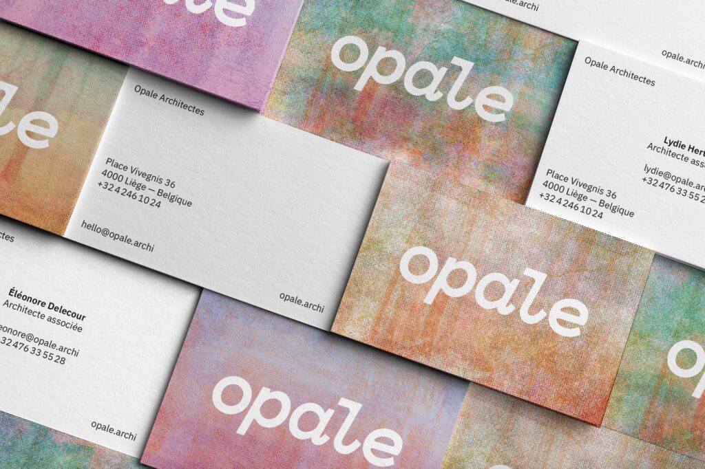
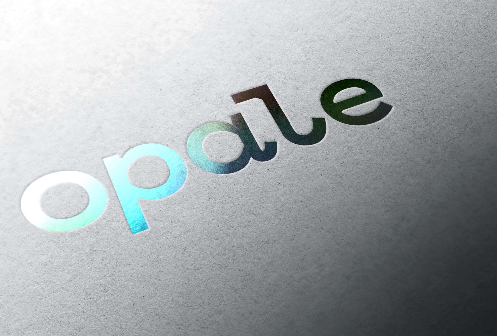
Opale Architectes
A collaborative architecture practice rooted in context, materiality and use. I developed the full brand strategy and visual identity, a precise, lowercase logotype with subtle architectural details, paired with risograph-inspired textures that evoke craft, materiality and the beauty of imperfection. The system spans logo, stationery, graphic design and a fully hosted website. The visual language deliberately contrasts with the polished smoothness of typical architectural branding, reflecting a practice grounded in reality and human scale.
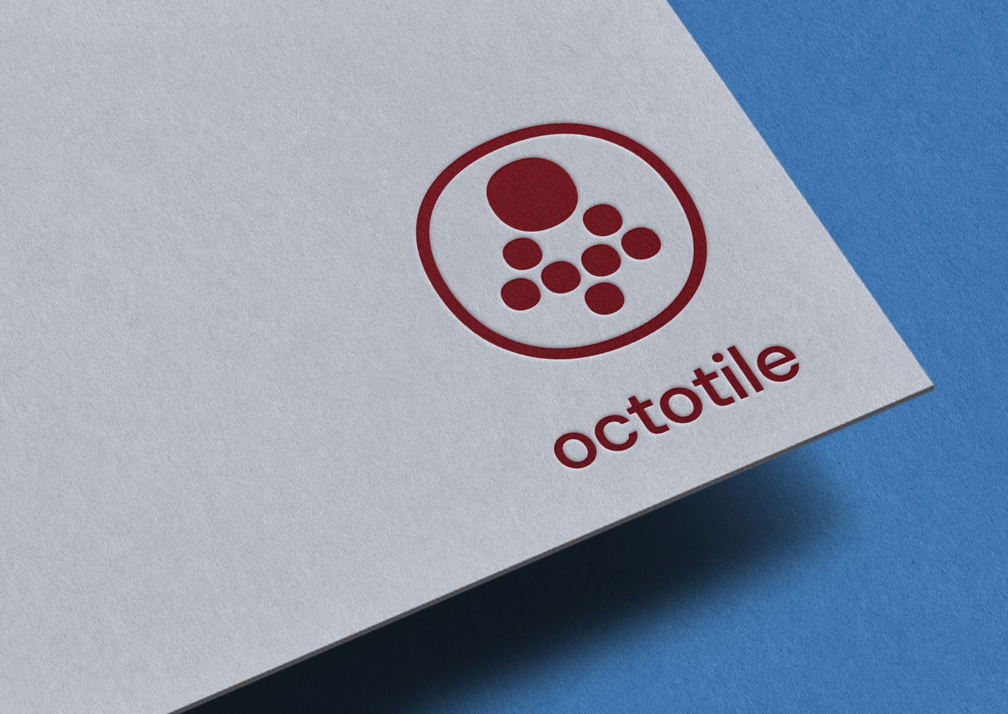
Octotile
Brand identity and visual concept for Octotile, a digital asset management tool designed to bring clarity and structure to complex file ecosystems. The project covered the full brand creation process: naming, logo design, colour palette, typography selection, stationery system and brand guidelines. The logo, built from eight circles arranged in a visual hierarchy, draws on the intelligence and reach of the octopus as a metaphor for centralised, intuitive content organisation. I selected DM Sans for its geometric clarity and developed a two-colour system (Carmine and Cerulean) balancing authority with accessibility. The result is a cohesive, scalable identity ready for digital product launch.
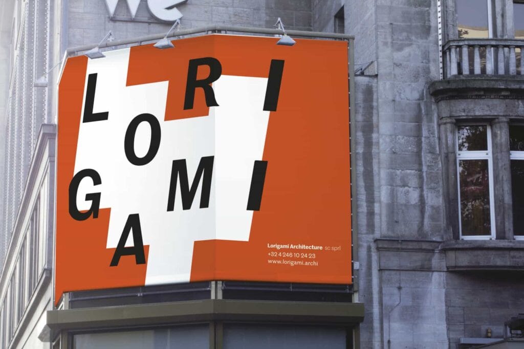
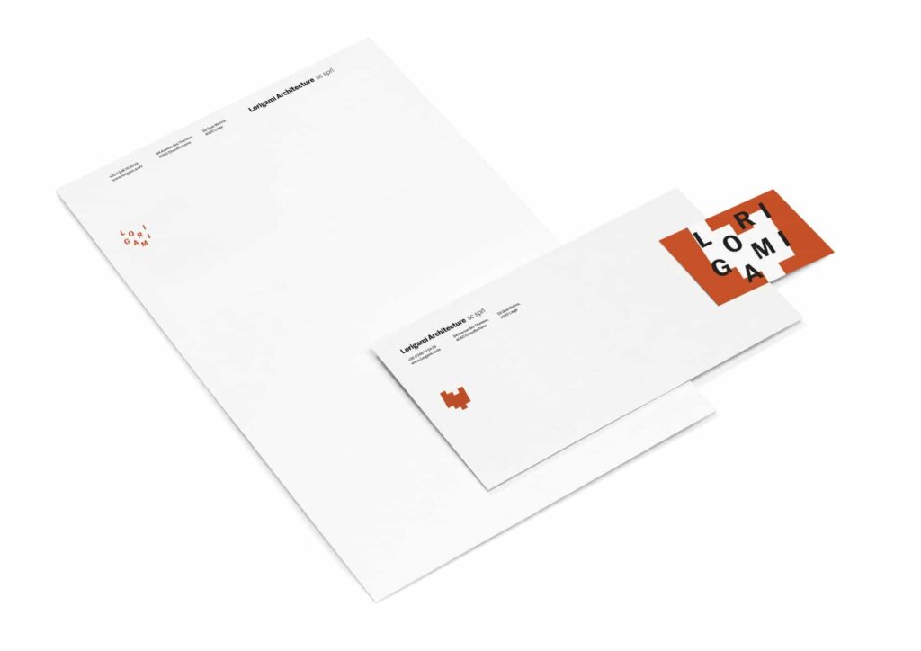
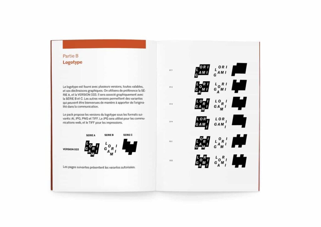
Lorigami
An architecture studio focused on sensitivity, precision and attention to the human scale. The identity was built through close collaboration with the founders, moving from market analysis and competitive review through concept exploration to a modular logo system, one identity, multiple forms, each reflecting the specificity of an architectural project, built on a strict geometric grid. I also designed and hosted the website and configured collaborative tools.
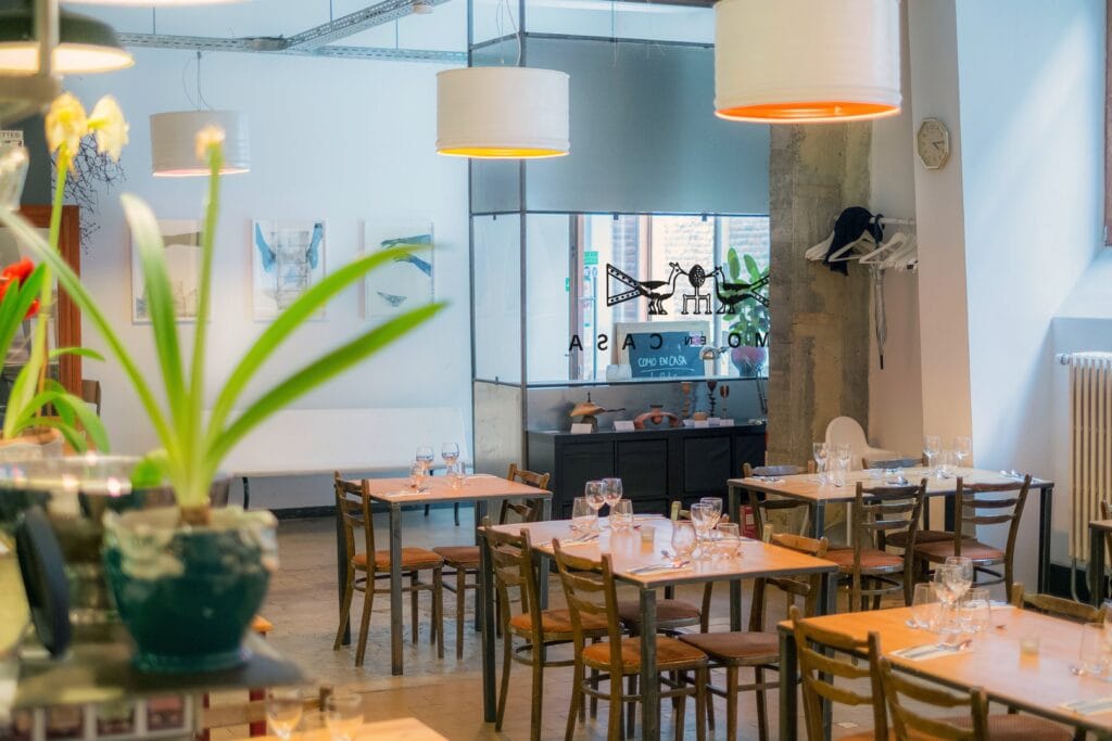
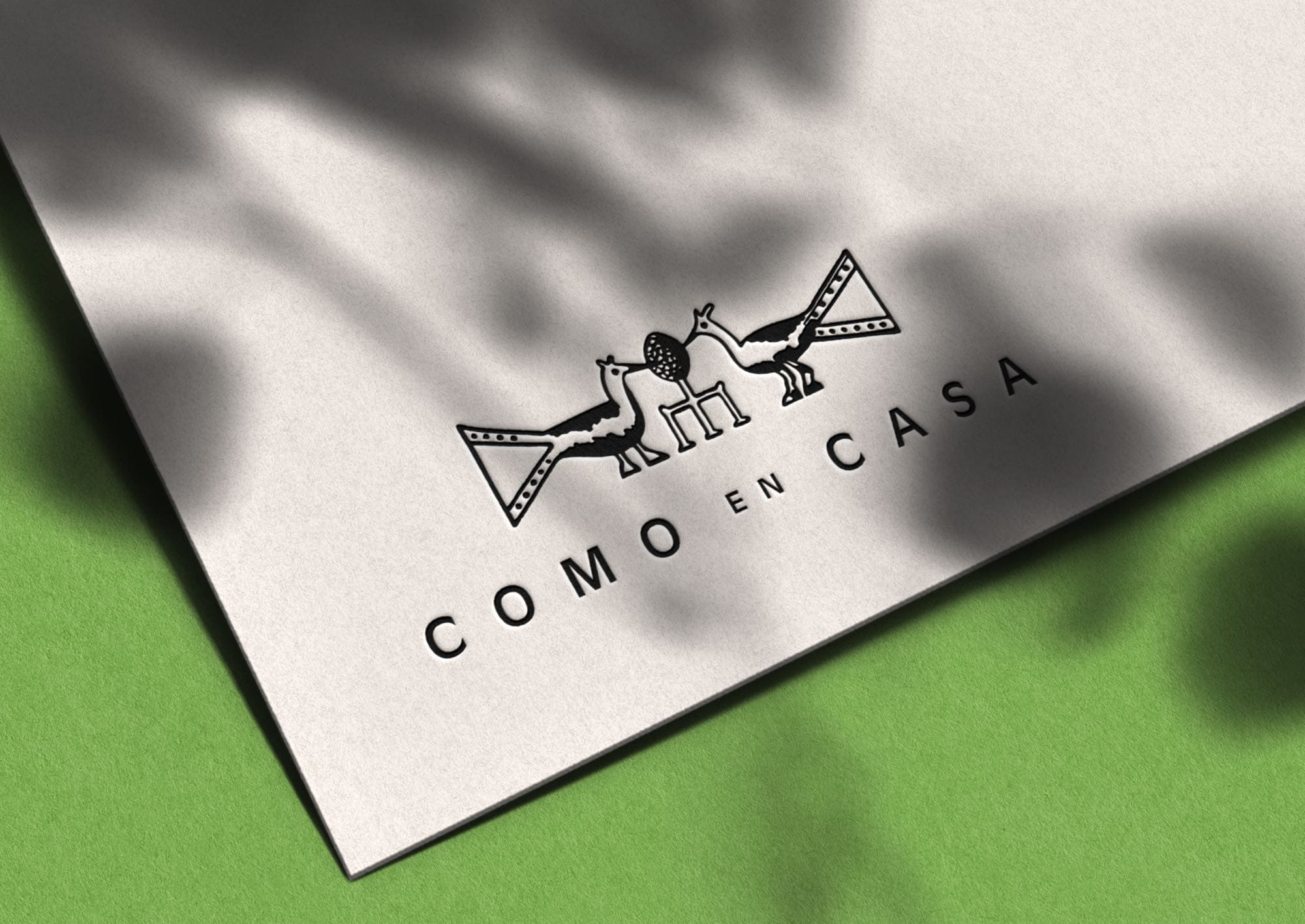
Como en Casa
A vegetarian and vegan restaurant in the heart of Liège. I designed the visual identity around the Perron de Liège (a local landmark steps from the restaurant) creating a warm, sympathetic graphic language with precise typography that reflects the care and authenticity of the cuisine. I built a streamlined website focused on a single function (online booking) and configured social media platforms and search engine optimisation.
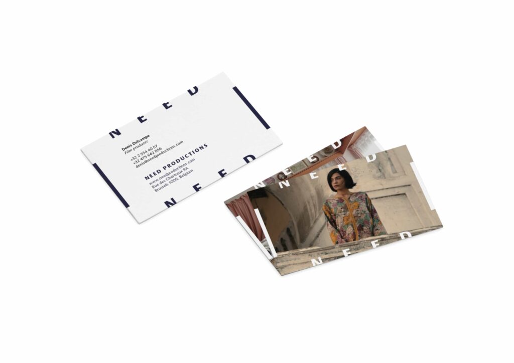
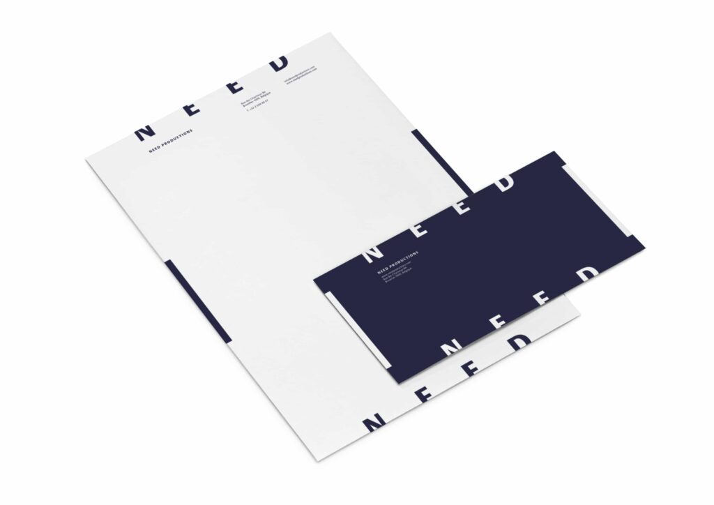
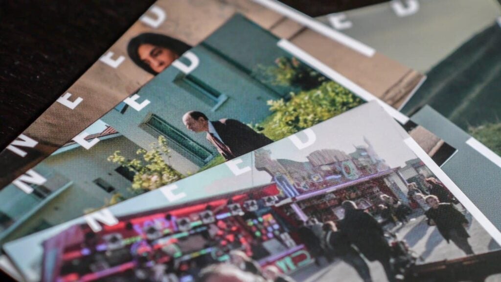
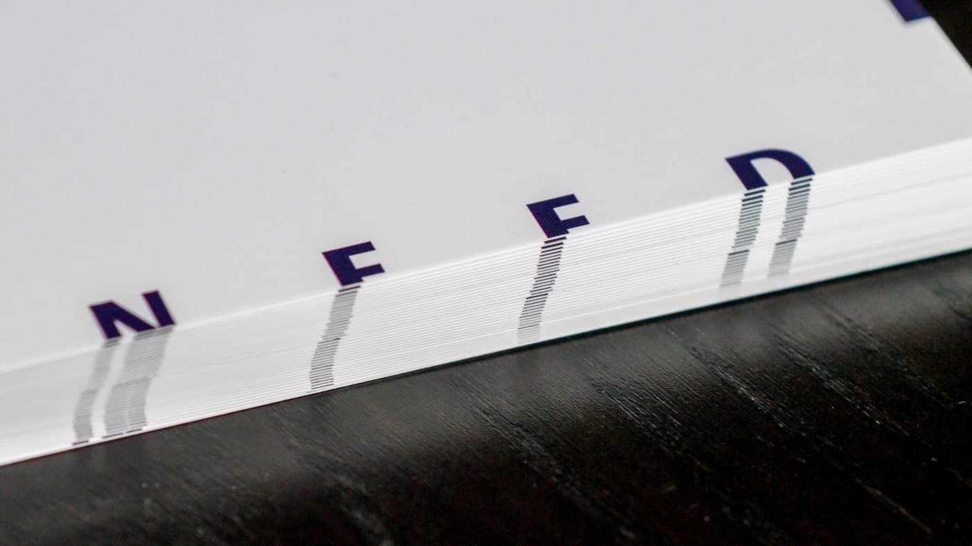
Need Productions
A production company founded in 1999 with over forty feature films, documentaries and shorts to its name. The rebrand was built on a single idea: to need is to desire something we don’t yet have, so the full logotype is never entirely visible. A provocative, conceptual identity that reflects the restless creative drive behind the company. I designed the brand system and stationery, built a website featuring their film database, and configured social media accounts with guidance on autonomous content management.
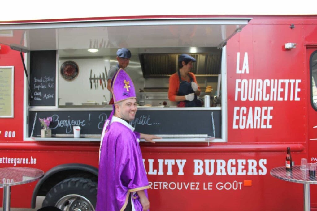
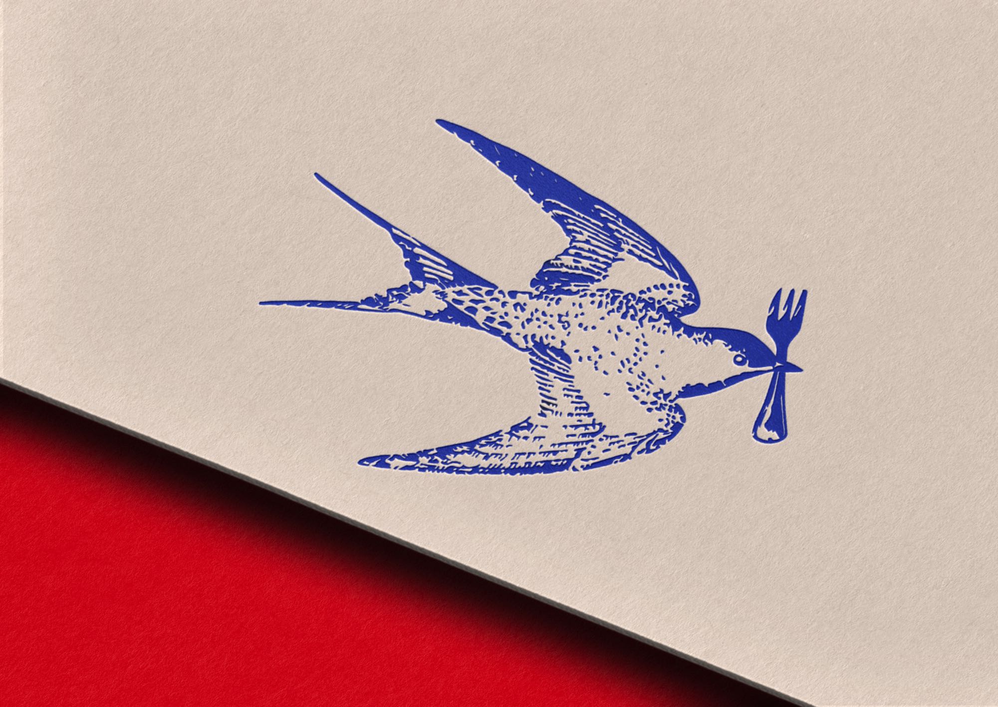
La fourchette égarée
A gourmet food truck serving craft burgers with quality, traced ingredients. I developed the full brand, from strategy through art direction to packaging design. The concept: a bird carrying a fork in its beak, representing the truck’s nomadic journeys and the absence of a fixed restaurant. The visual system uses bold American-style typography and a striking red livery, applied across the truck itself, packaging, Instagram content and a website designed to help fans locate the truck.
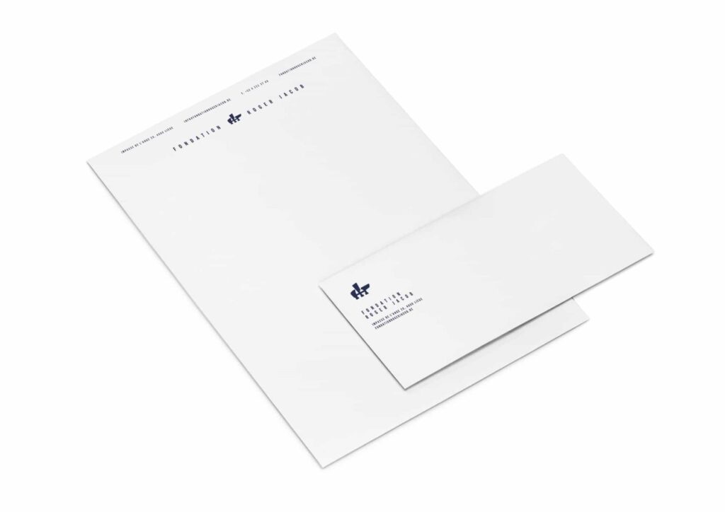
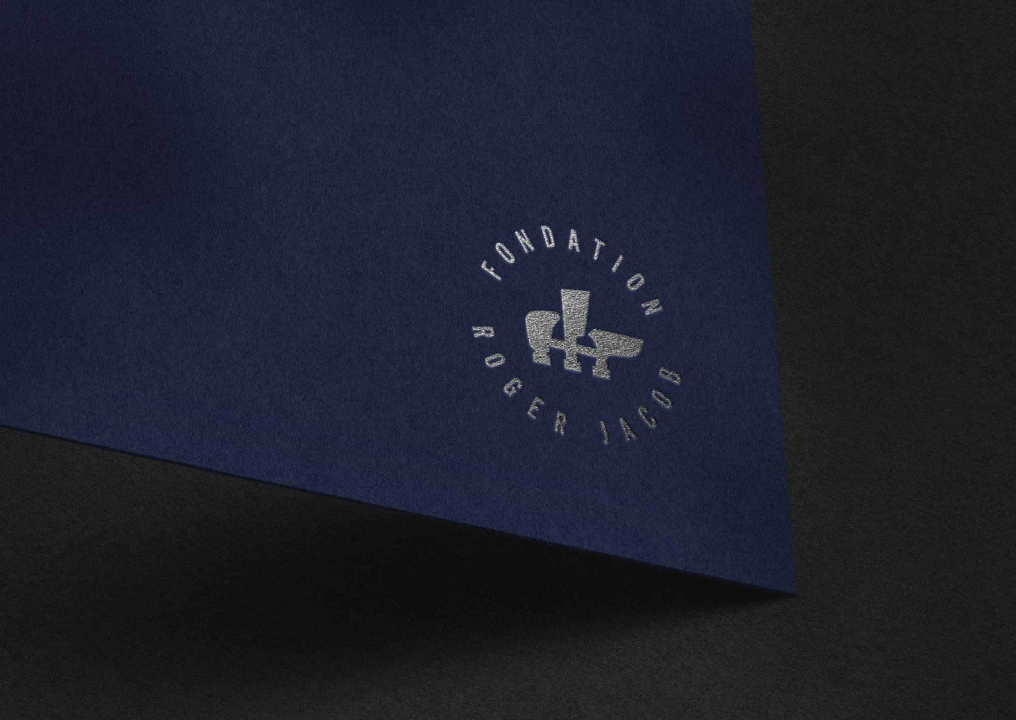
Fondation Roger Jacob
The Fondation Roger Jacob was founded by Jean Delruelle and the artist’s daughter, Caroline Jacob, in 2010. Its first objective was to promote the work of the sculptor Roger Jacob, but its interest now shifted to contemporary artists, mainly from Liège.
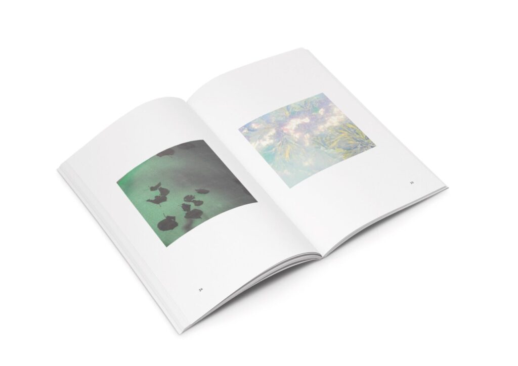
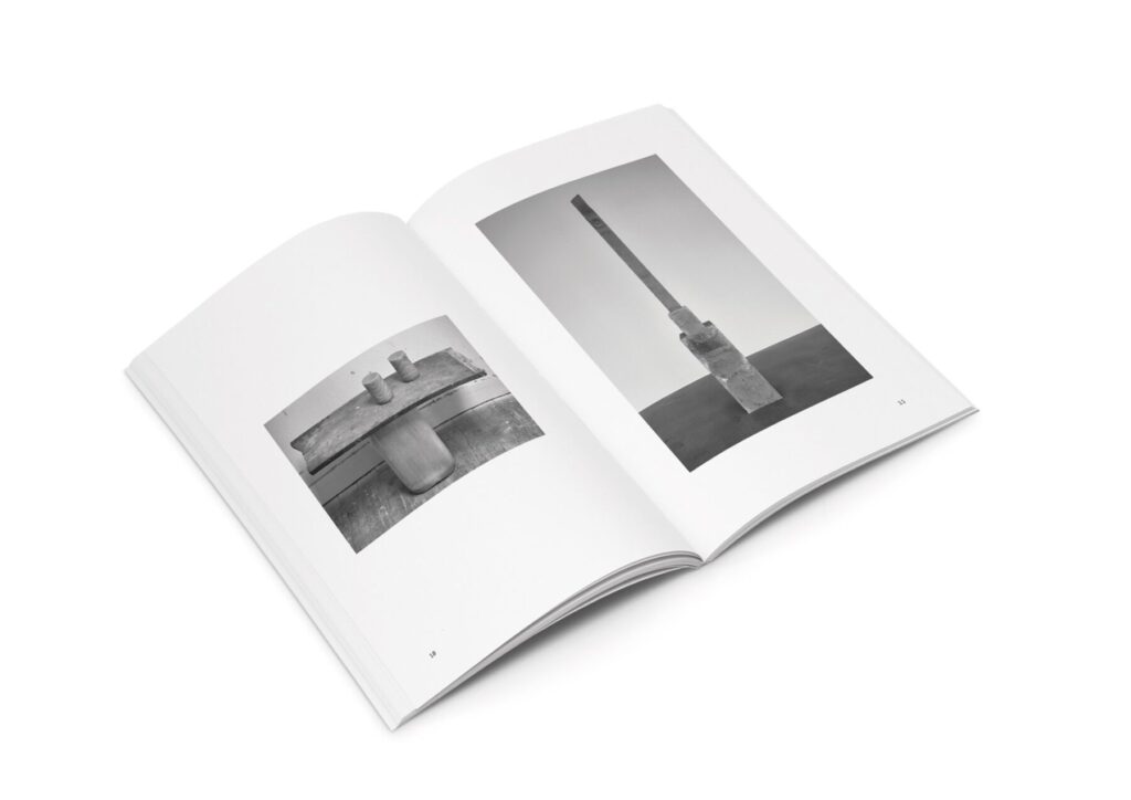
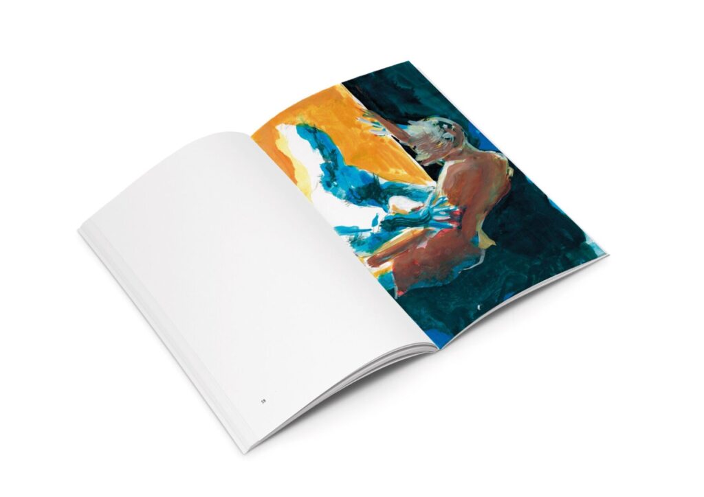
I designed several books collaborating with numerous artists such as Sébastien Plevoets, Pierre Pétry, Vanessa Cao, and Eric Deprez, adapting the layout to the artists’ will. Every book is distinctive.
They were printed in Liège by Raymond Vervinckt & fils. The Foundation sold fifty signed copies each time during the opening.
At the origins, the story of an artist
The Foundation commissioned a film about the Belgian sculptor Roger Jacob (1924-1975), based on filmed family archives and photographs. The movie I edited features a soundtrack by Elise Dutrieux and has been shown at exhibitions.
Le Beau Pays
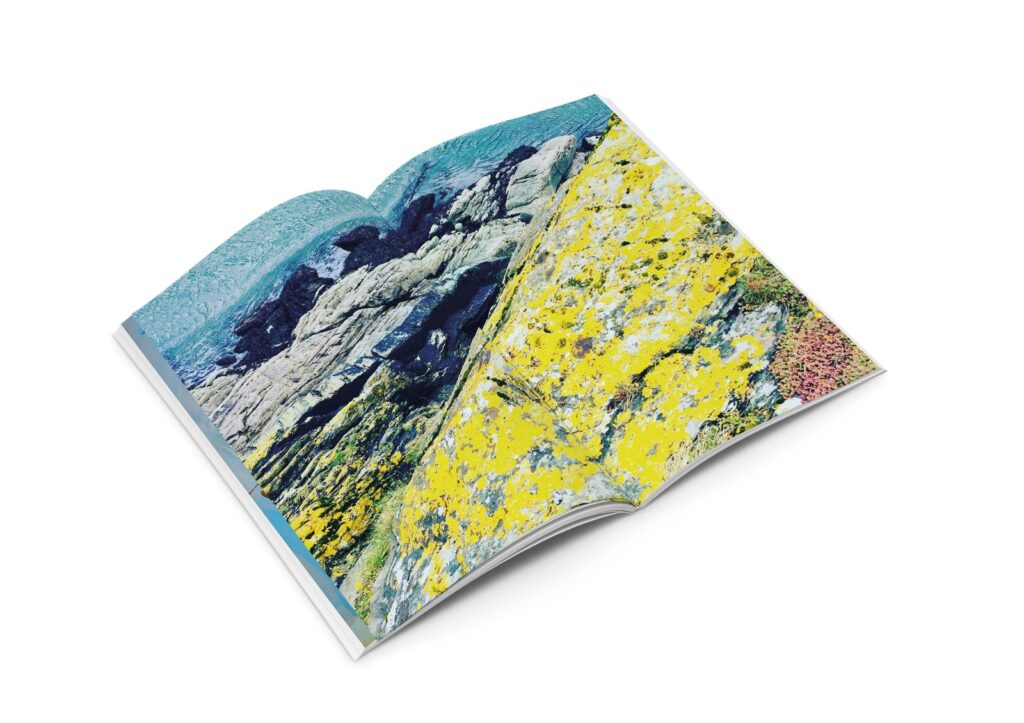
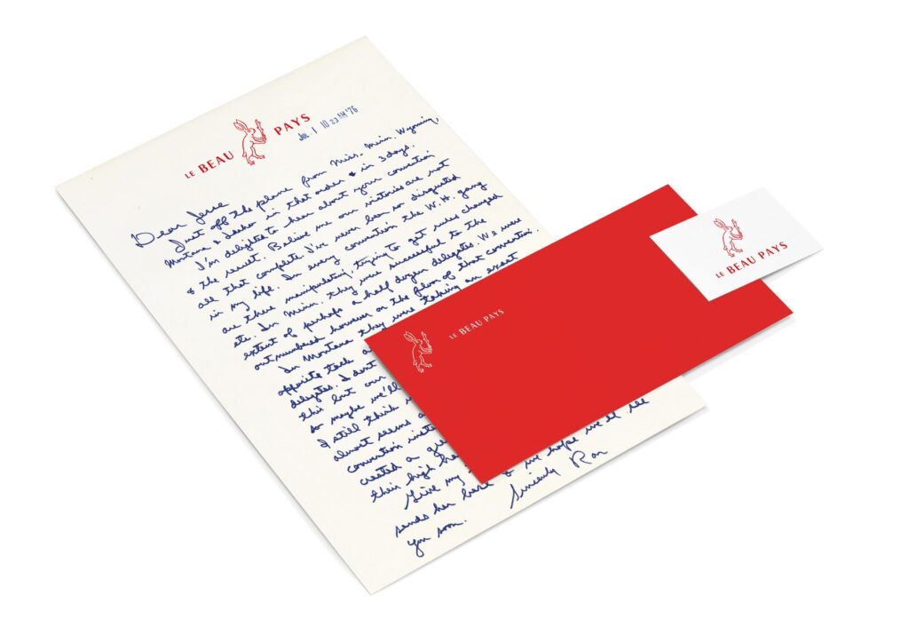
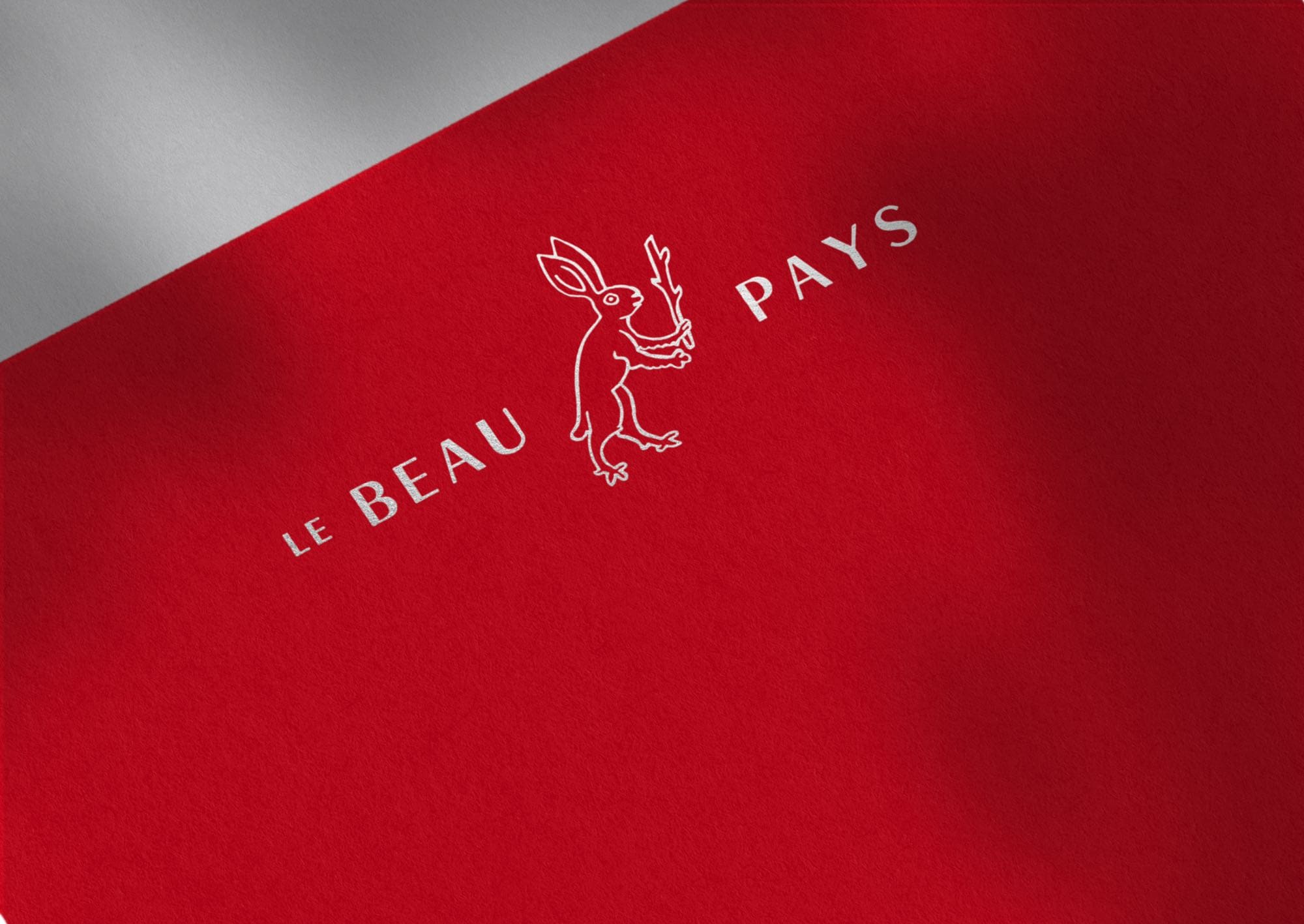
Le Beau Pays is a collective of artists in search of a better imaginary world, one built on shared values, creative solidarity, and a reimagined sense of community. For their inauguration ceremony, I designed a visual identity rooted in archival research. Digging through incunabula, the earliest printed books, produced before 1501, I came across marginal illustrations of rabbits carrying batons or clubs, a motif that recurs in medieval manuscripts with quiet subversive energy. These armed rabbits (known as rabbit reversals or mundo inversus imagery) belong to a long tradition of topsy-turvy iconography, where the hunted become the hunters and the powerless seize the staff of authority, a gentle but pointed comment on the natural order of things. It felt like the right emblem for a group that believes another world is not only possible, but worth building.
A film production company with a clear creative vision and long-term ambition. I worked closely with the founders to understand their positioning in a highly competitive landscape, conducting market analysis, reviewing the existing identity’s strengths and weaknesses, and exploring thematic directions. The resulting logo symbolises the central relationship of cinema: a focal point (the film project) around which all stakeholders gravitate, from production through post-production.
A 4K animated logo was created in collaboration with WhiteMilk Studio for theatrical projection.
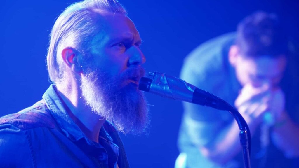
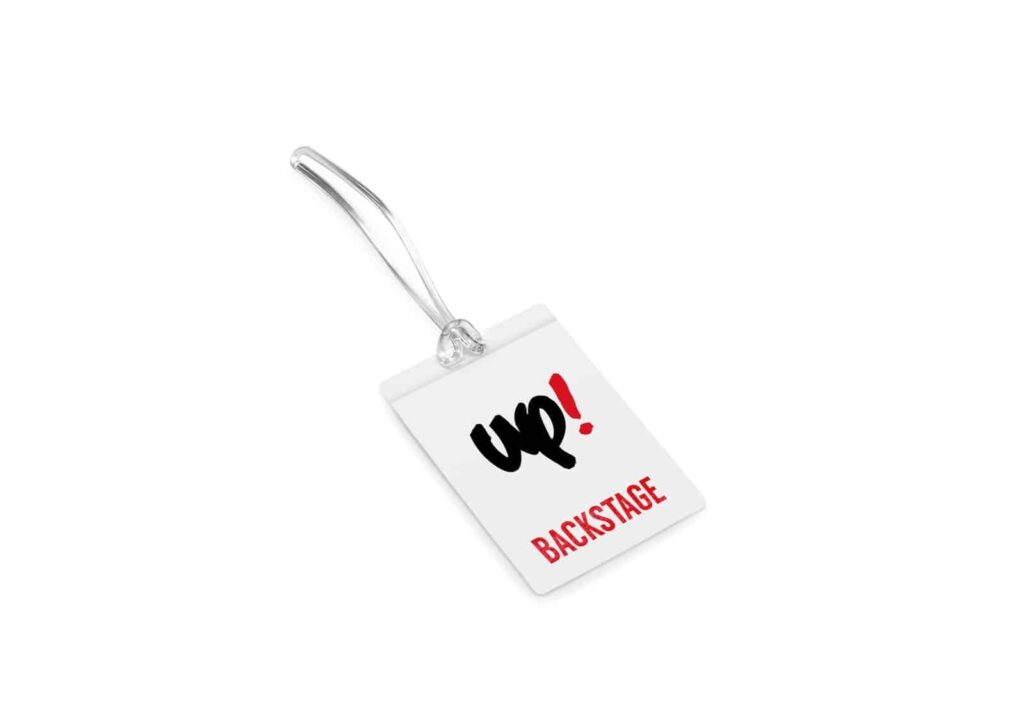
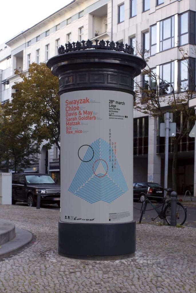
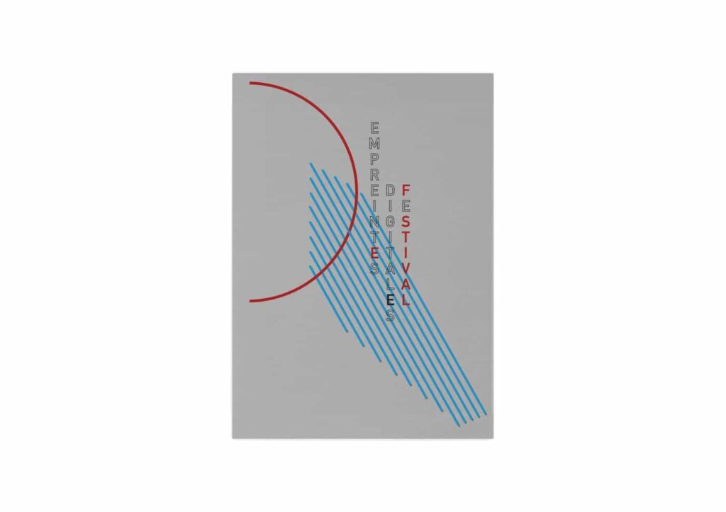
Music, Festivals & Live Visuals
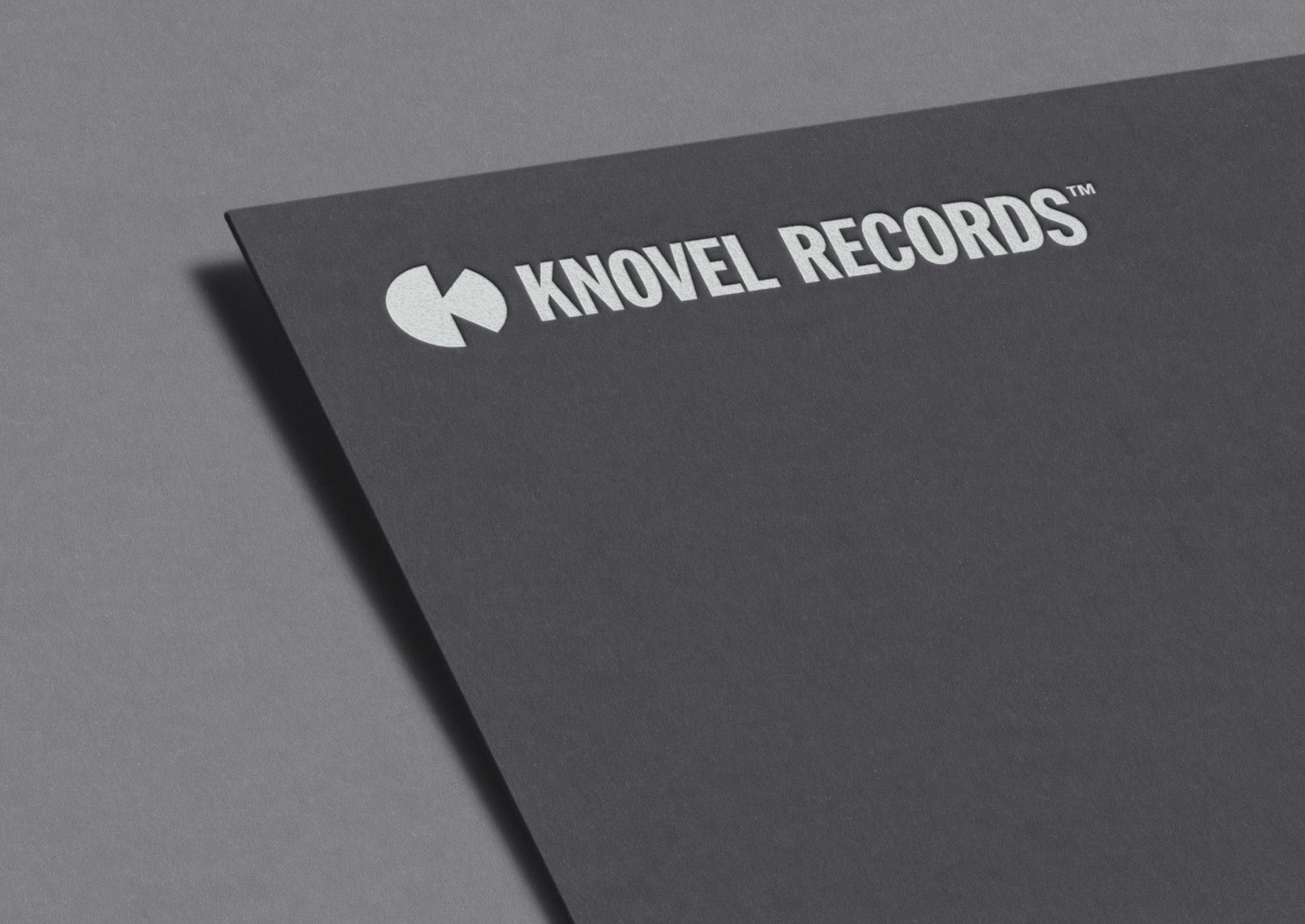
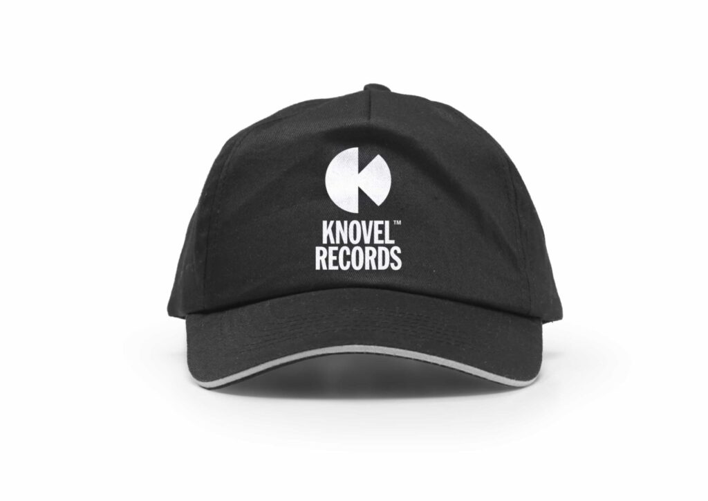
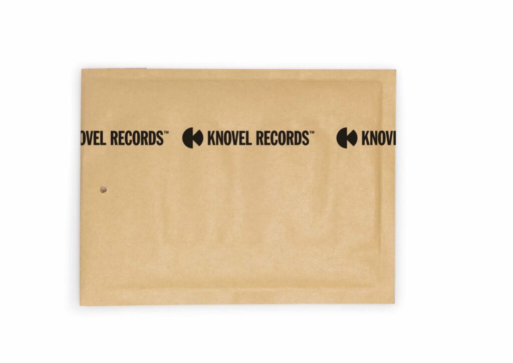
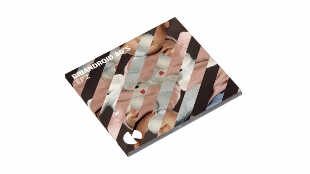
Since 2008, I have collaborated with music producers, netlabels and festival organisers in Liège, Belgium, delivering brand identities, album artwork, event flyers and promotional video content. Projects include visual identities for Knovel Records (an electronic music netlabel), Empreintes Digitales (a contemporary art and music platform) and Democulture (an alternative music non-profit producing the annual Up! Festival and concert series). I also performed live VJing, creating synchronised visuals driven by free interpretation of the music.

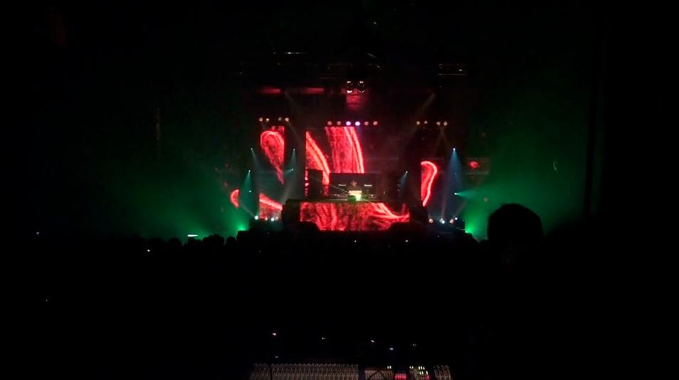
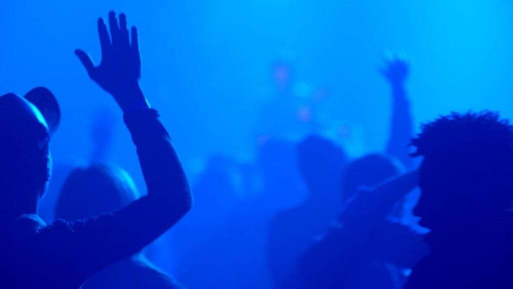
Live vjing in collaboration with animator artist Lia Bertels for Jeff Mills at Transardentes, Liège, Belgium (2009). We created synchronized visuals that let creative exploration and free interpretation of the music.
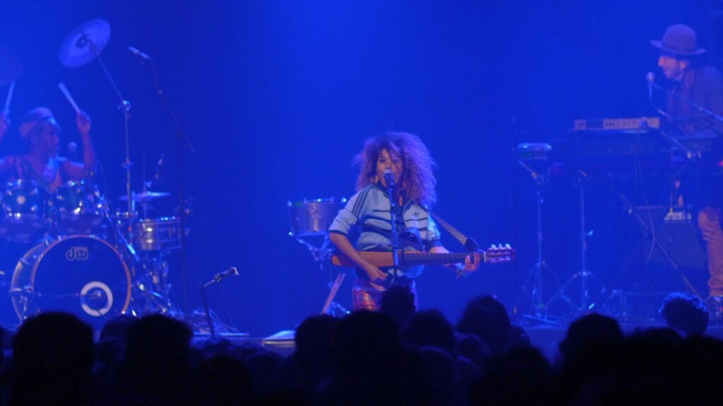
Celebrating achievement with video
For the 14th edition of Up! Festival, I shot, edited and colour graded a short music film that was widely shared on social media. A project with one brief: have fun. I created the logo a few years earlier.