DIAGENODE. A PRIME EXAMPLE OF HOW GRAPHIC DESIGN CAN LEAD THE WAY.
A complete wayfinding and signage system for a biotech company specialising in epigenetics and diagnostic kits for viral diseases. Designed in preparation for a building extension led by Atelier d’Architecture Daniel Delgoffe, the project covered the identification and graphic treatment of more than 200 doors and circulation areas, creating a scalable visual system built to grow with the organisation.
CLIENT:
DIAGENODE
ROLE:
SIGNAGE DESIGNER & PROJECT LEAD
YEAR:
2017
Process & Delivery
I began with a site walkthrough and stakeholder meetings to understand operational needs and spatial logic, then studied architectural plans to inventory every element requiring graphic treatment. I designed a modular signage system with a clear typographic and colour framework, and produced a detailed implementation guide enabling the vinyl lettering company (DKD) to execute the installation autonomously and precisely across the entire building. The result is a coherent, functional wayfinding identity that serves both daily navigation and long-term scalability.
“It is an excellent work by Lionel Orient Dutrieux and DKD down to the smallest detail. Flexibility and listening in the preparation, rigor and precision in the execution for a coherent result. “
Olivier Reynaert, Supply Chain & Facility Manager at Diagenode
Typographic Framework
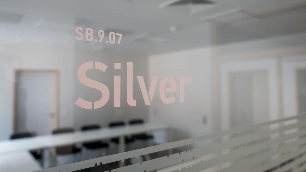
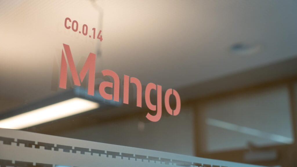
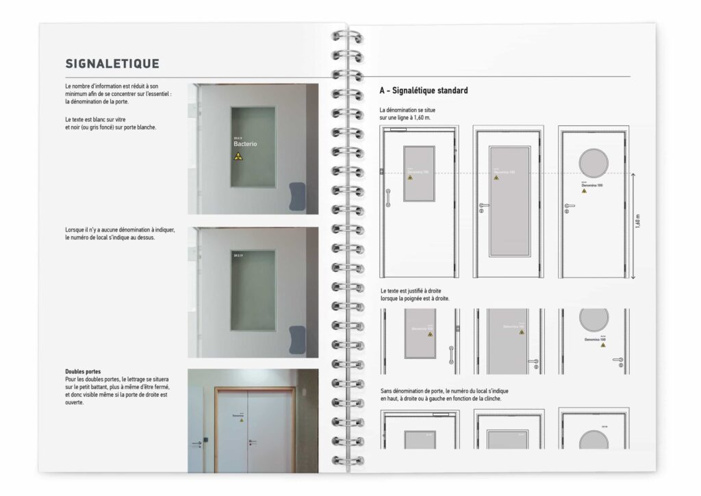
The signage system was built on Diagenode’s existing brand typography, PF DIN by Parachute foundry, and its departmental colour coding: cardinal red for Epigenetics, blue for Diagnostics and grey for Administration. I developed a modular typographic hierarchy using three weights (DIN Text Condensed Thin, DIN Stencil Medium and DIN Text Condensed Bold) at defined sizes, creating a system that could accommodate every door configuration in the building: glazed panels, solid doors, portholes and double doors, with text alignment adapting to handle orientation. Vinyl lettering was applied directly to glass where possible, so that information invites rather than blocks, visible from the corridor, readable in reverse from inside the room. The colour, type and positioning rules were documented in a specification guide for future-proof application as the building expands.
Scalable Asset Management
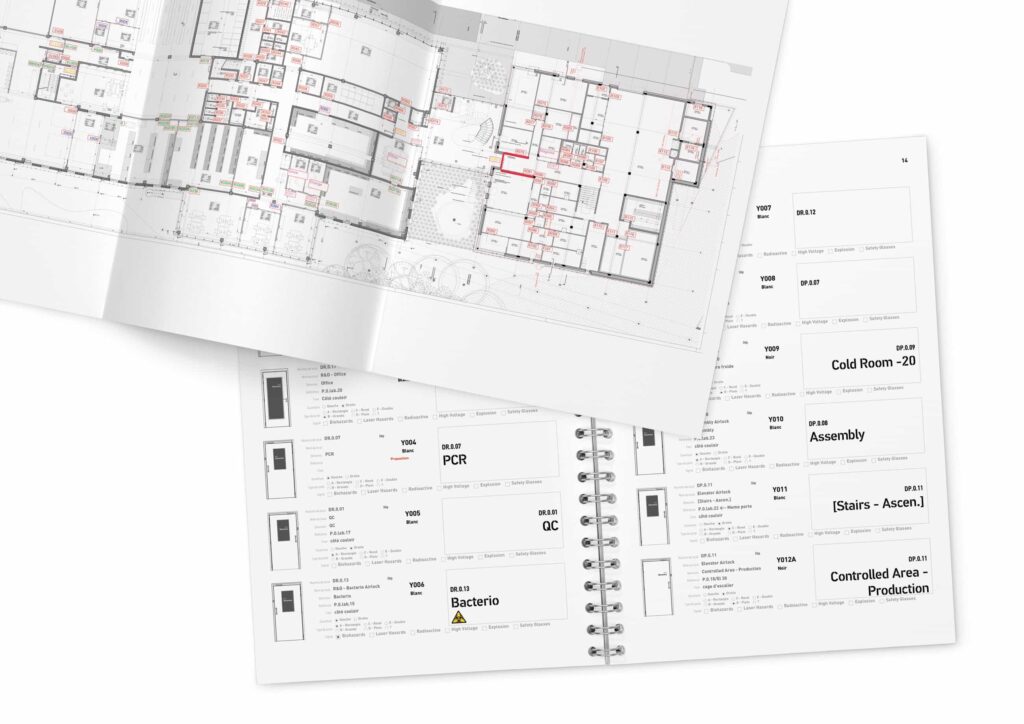
With over 200 doors to identify across two departments and a growing building footprint, systematic asset management was critical. I inventoried every door from architectural plans and a full building walkthrough, then created a standardised data sheet for each, recording room number, denomination, door type, handle side, safety signage requirements and department affiliation. This inventory served as both a production checklist for the vinyl contractor (DKD) and a living reference document, enabling the facilities team to add new doors autonomously following the same rules as the building scales toward its planned 5,000 m² expansion. The project was delivered on a compressed three-week timeline from first concept to final installation.